Benefits of Responsive Design Web Page
Posted by: Omar Elkholy
June 18, 2023
What do modern websites look like?
Modern websites usually feature streamlined designs with clean lines, open-ended navigation menus, flat, 2-dimensional graphics, full-width images, and bold colors. Responsive design elements are also popular, as websites must look good on any device they are accessed. Modern websites also typically feature high-quality content, intuitive navigation, optimized images, loading speed and performance, and easy-to-use forms.
What does a responsive website design mean?
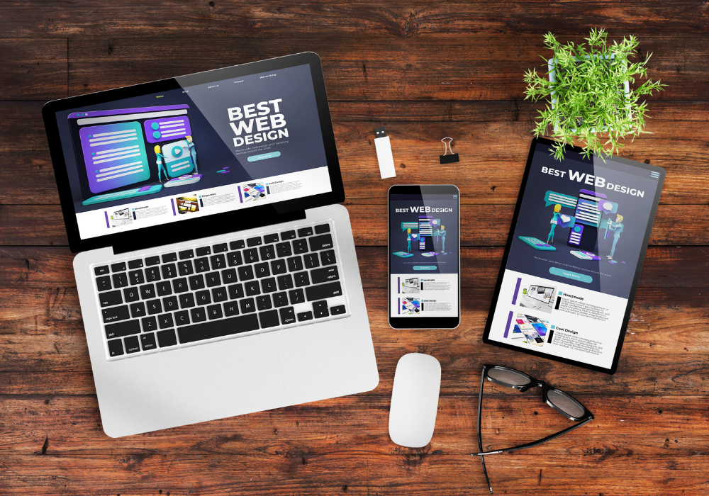
Responsive website design is a web design approach that creates layouts that respond and adapt to the device used to view them. Responsive websites automatically adjust their layout and content to fit the screen size used to view them, whether a smartphone, tablet, laptop, or desktop computer. This approach ensures that users have a consistent experience across different devices while delivering a website design tailored to the viewing device's size and shape.
How to manage a responsive design for different screen sizes ?
1. Plan for a mobile-first approach: Start with smaller device sizes and work up to larger sizes. This allows you to focus on creating an optimal experience for most users while ensuring that all users—regardless of device—have access to your content.
2. Structure your HTML using media queries: Using media queries, you can define styles that will vary based on the type and size of the device. This will allow you to adapt your design for different device sizes.
3. Rely on a flexible grid: It helps you structure your content to ensure it looks good on any device. This can be especially useful when designing for various screen sizes, as you can adjust the layout to ensure it looks great regardless of the size.
4. Use responsive images and videos: Responsive images and videos resize depending on the device's size, ensuring they look good no matter how wide or narrow the screen is.
5. Utilize CSS3 animations: CSS3 animations are a great way to add dynamism to a responsive design. They can be used to may subtle transitions that will help enhance the experience for someone viewing your design on a touch device.
Tips for Perfect Newsletter Design 
Users use mobile to view websites more now
In recent years, the use of mobile devices to access websites has drastically increased. People of all ages rely on their mobile devices to browse, shop, research, and otherwise interact with websites on the go. Websites must now adjust to meet the demands of a larger mobile audience to remain competitive in the online marketplace and provide a satisfactory user experience. As mobile usage continues to grow, web designers and developers must continue to adjust to stay relevant and up-to-date.
Maximizing Your Brand's Potential with a Basic Website The benefits of responsive design for your web pages
The benefits of responsive design for your web pages responsive design is the process of designing web pages to work across multiple platforms and devices such as smartphones, tablets, and desktop computers. Responsive design aims to create web pages that seamlessly adjust to different screen sizes and resolutions, providing an optimal viewing experience no matter the device.
1. Improves User Experience: A key benefit of responsive design is that it helps users have a more consistent experience across all devices. Users who access your website from a mobile device don’t have to zoom and scroll around a clumsy desktop layout. Moreover, a responsive design ensures all elements of your web pages stay optimized for different screen sizes, making them easier to interact with and use.
2. Increases Traffic: Responsive design is essential for achieving higher user engagement, which can increase website traffic. People spend more time on sites that are easy to navigate and interact with, resulting in a better user experience.
3. Increased SEO Benefits: Search engines heavily favor web pages optimized for multiple devices, and responsive design allows websites to adhere to this requirement. Site owners can also create separate, device-specific URLs to target users more effectively.
4. Saves Money: Responsive design eliminates the need to create a separate mobile website, saving website owners the additional development cost.
Conclusion
Responsive design offers many benefits and should be considered when designing and optimizing a website. By leveraging all its advantages, websites can become easier to navigate and use, resulting in a better user experience and increased website traffic.
Contact us today for a quick quote on website design and development.
Learn more about Strategic Connection's Website Design Services.